
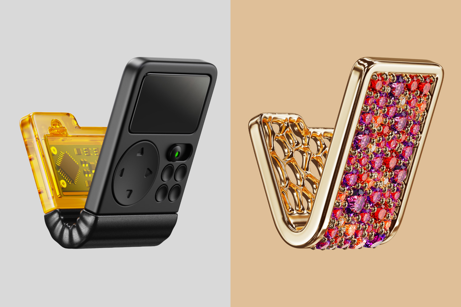
So I 3D modelled two icons (well, illustrations rather) for the communities that I created on kbin: Industrial Design and Jewelry Design. These icons are meant to reimagine kbin’s logo in a way that’s relevant to each community.
Btw, as a feature request, I think it might be cool to separate the banner on a magazine’s page from the mini-icon that shows up in listings. Also, inline images should be a thing, I think.
Industrial Design: icon
This icon is just an assortment of various gizmos and whatchamacallits that seemed to fit the shape. It was modelled in Rhino and rendered in Keyshot. The model uses curvature continuity, just like any self-respecting grown-up model would.
Ghosted view, plaster view
Jewelry Design: icon
This icon is designed as a hypothetically producible piece of jewelry, except that the corners — those tiny semi-spheres that hold the gems — are a tiny bit larger than usual to accommodate the icon’s scale. The piece has a partially open back — a common practice in jewelry design — to allow for more light to reach the gems. That makes them look prettier both in renders and irl.
Front view, back view
The model was created in Rhino and later welded and polished in ZBrush to make it appear closer to how it would look in real life.
zBrush smoothing
Want one?
Creating these was a lot of fun, so I’m open to making a few more. If you’re the owner of a magazine and would like to have a similar icon, comment here to discuss it. I’ll be creating these during my free time on weekends, so I probably won’t be able to make more than a couple pieces a week though.
@fearout
These look great! Just the right amount of detail.
I have created @3dmodeling and @zbrush here, so if you’re interested in sharing these there too I’d personally love that!Sure. Also, subscribed :)
@fearout
was replying from mobile - so I’d like to add here… Great work on the texturing! The materials really look like their real life counterparts, perhaps even a bit more edible than supposed to. Which is a good thing.Thanks! Also, here’s one if you’d like something similar to your current one for your community.
deleted by creator

