Hello everyone,
This community is only a few hours old, and already there is a meta post ha ha.
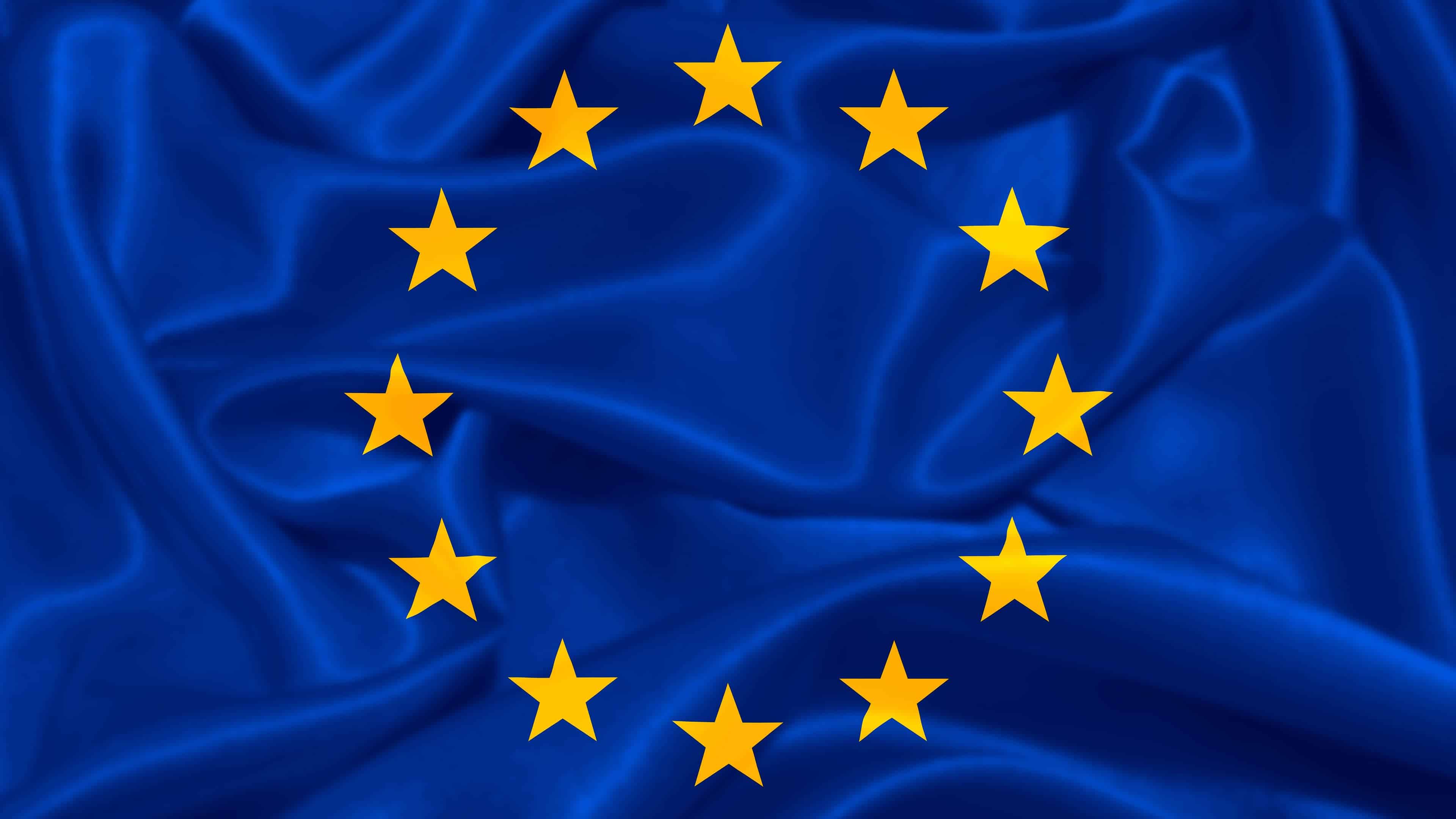
I was just thinking that the EU flag doesn’t include non-EU countries such as Switzerland, the UK, Norway, Ukraine, Iceland, Albania, Georgia, etc.
Maybe a more “map-based” logo like this one could be considered too?

The EU flag is technically also the flag of the Council of Europe, of which Switzerland and Co are members. The only European countries not in the CoE are Belarus and the Vatican though Russia’s membership is suspended.
Interesting, thanks for sharing!

I suggest my drawing of Europe by memory. Your favourite country might not even be in there but it’s simple so you can see it as a small icon! I see no downsides.
No. The EU flag is the flag of Europe too and actually predates the EU. It was merely adapted for it too. https://en.wikipedia.org/wiki/Flag_of_Europe
I think the flag is fine personally. It’s very clear what the community is about.
Europa on a bull might work, if we can find a simplified enough version of it…?

Nice, but probably too complex… :-)
Here is one. (Not sure it would be readable as a 32x32 icon.)
Source: https://www.makeeuropenotwar.eu/de/portfolio/bleib-cool-und-mach-europa/
Unrelated, but that map is a little bit funny. Eastern Latvia apparently seceded, Ireland reunited and there’s a big lake between Romania and Bulgaria.
Keep it as it is, I say.
While it may not nominally include them, the flags stars represent the coming together of countries. Stars ate no longer added to represent individual countries as theynjoin, so i thinknit still fits.
Using the map works but as a circular icon it will also exclude countries or be too small, so it doesn’t fix the problem presented.
Its not ideal as a logo but unless a better option presents, I’d keep itnover a map. Unfortunately, this specific map is not loading for me. Possibly an update issue.
It now loads for me. Ireland and northern irelands borders are incorrect. I too blame Brexit, lol.
But as suspected, of this was used, Iceland would be cut off as would Portugal and lots of others depending on selected Centre.
You’re right but the flag is easy to read even at low resolution. Not sure that a map would make for a good small icon.
Even in all black, it’s kind of hard to see at low resolutions (ignore the superimposed flag, this is just what I found on the internet):

Thank you for your comment!
As a comparison, the way !yurop@lemm.ee icon looks:
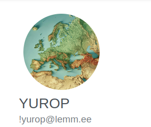
I guess the shape of the continent is unique enough to be distinguishable
This is what that looks like in Photon (e.g. at https://p.feddit.org):

And in the bottom bar, next to each other:

(Granted, it’s a little unfair, since Photon in particular appears to scale the icons in a dumb way.)
What’s dumb about the scaling? The resolution? if so, I’ll fix that.
Ooh, thank you! Sorry for the way I worded it. Anyway: To me, it looks weirdly pixelated, as if either:
-
It doesn’t take into account high-PPI screens and scales the image file for a 96ppi screen and then the browser scales it up to display size or
-
It just takes a file with huge image resolution and the browser scales it down quickly on the fly.
You can look at my screenshots.
I’ll try and fix that soon.
-
Seems reasonable on desktop, people are usually not having to look at the icon so much, they just want a way to quickly identify which community it is

Mobile might be another story
maybe a cute kitten
What about a heart emoji? We love europe ;) and it’s not taken by any other community on the fediverse that I know of :p
